What is CSS?
Cascading Style Sheets
CSS functions as the interior design and exterior paint of a house. While HTML forms the structural blueprint of a webpage, defining elements like walls, floors, and windows, CSS enhances the appearance by enabling customization of colors, textures, furniture arrangements, and decorative elements. In the analogy of a web document as a house, HTML represents the framework – the structure and layout, while CSS serves as the style, akin to choosing the color scheme, furnishings, and decor. Just as HTML defines the fundamental features like the foundation and structure of a house, CSS enhances the overall visual appeal, reflecting the personality and style of the webpage.
CSS Header Styles:
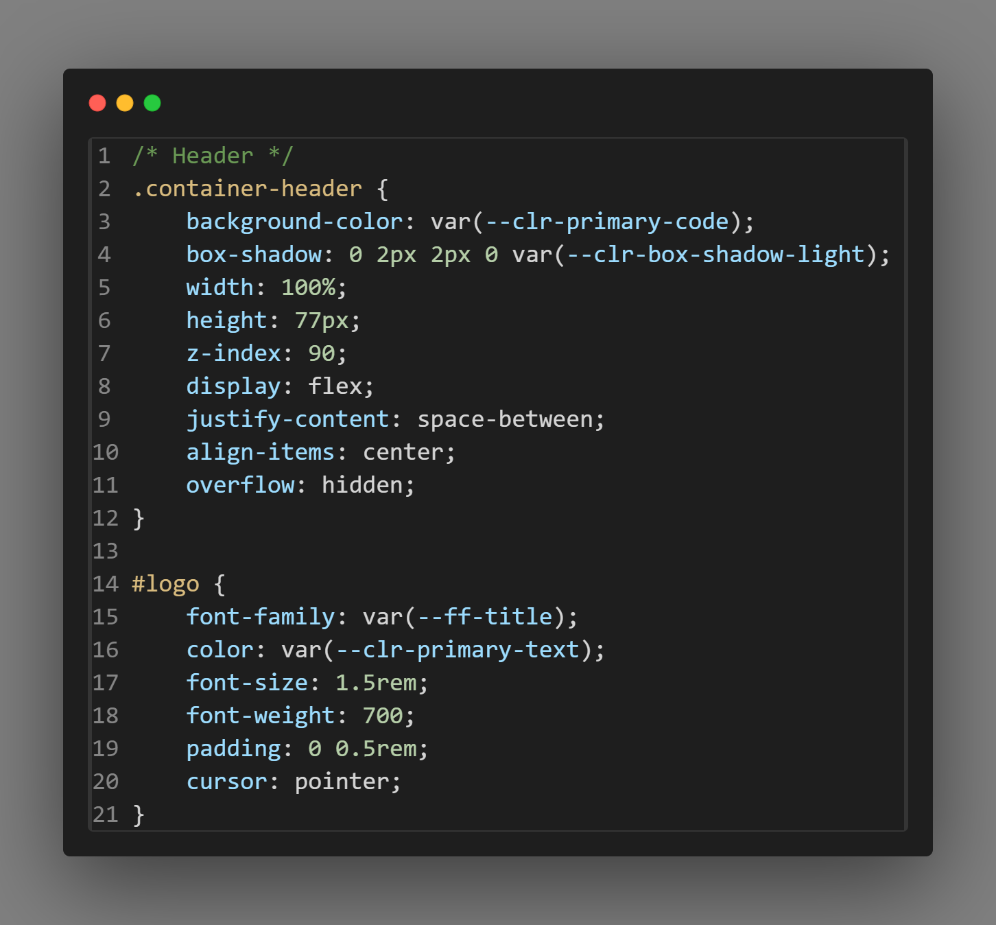
Header Styling:
The header section of a webpage often contains important navigation and branding elements. In the provided CSS code snippet, the ".container-header" class is used to style the header container. Properties like background-color, box-shadow, width, height, and display are applied to achieve the desired appearance. Additionally, the "#logo" ID selector customizes the styling for the logo, including font-family, color, font-size, and padding.
CSS Navbar Styles:
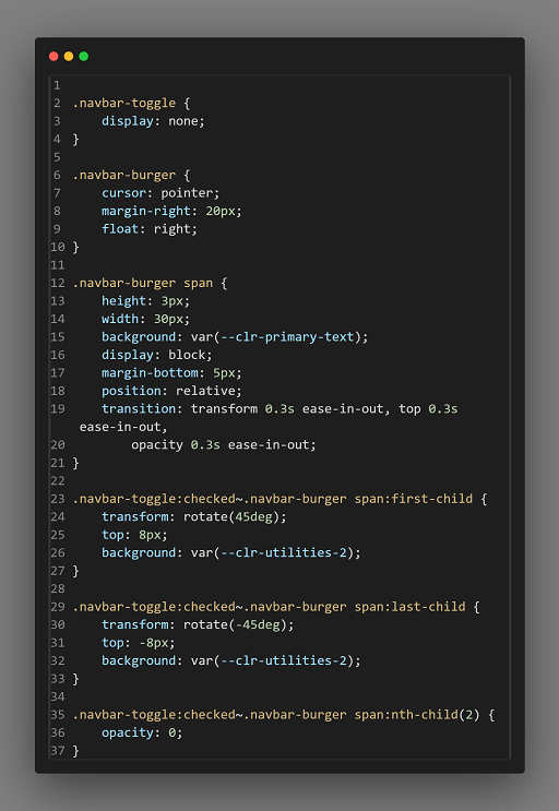
Navbar Styling:
The navigation bar, or navbar, typically includes links to various sections of the website. The CSS code snippet includes styling for a navbar with a burger toggle and slide effect. Classes like ".navbar-toggle" and ".navbar-burger" define the appearance of the toggle button for mobile navigation. Styling properties such as cursor, margin, and positioning are utilized to create the desired visual effect.
CSS Navbar Link Styles:
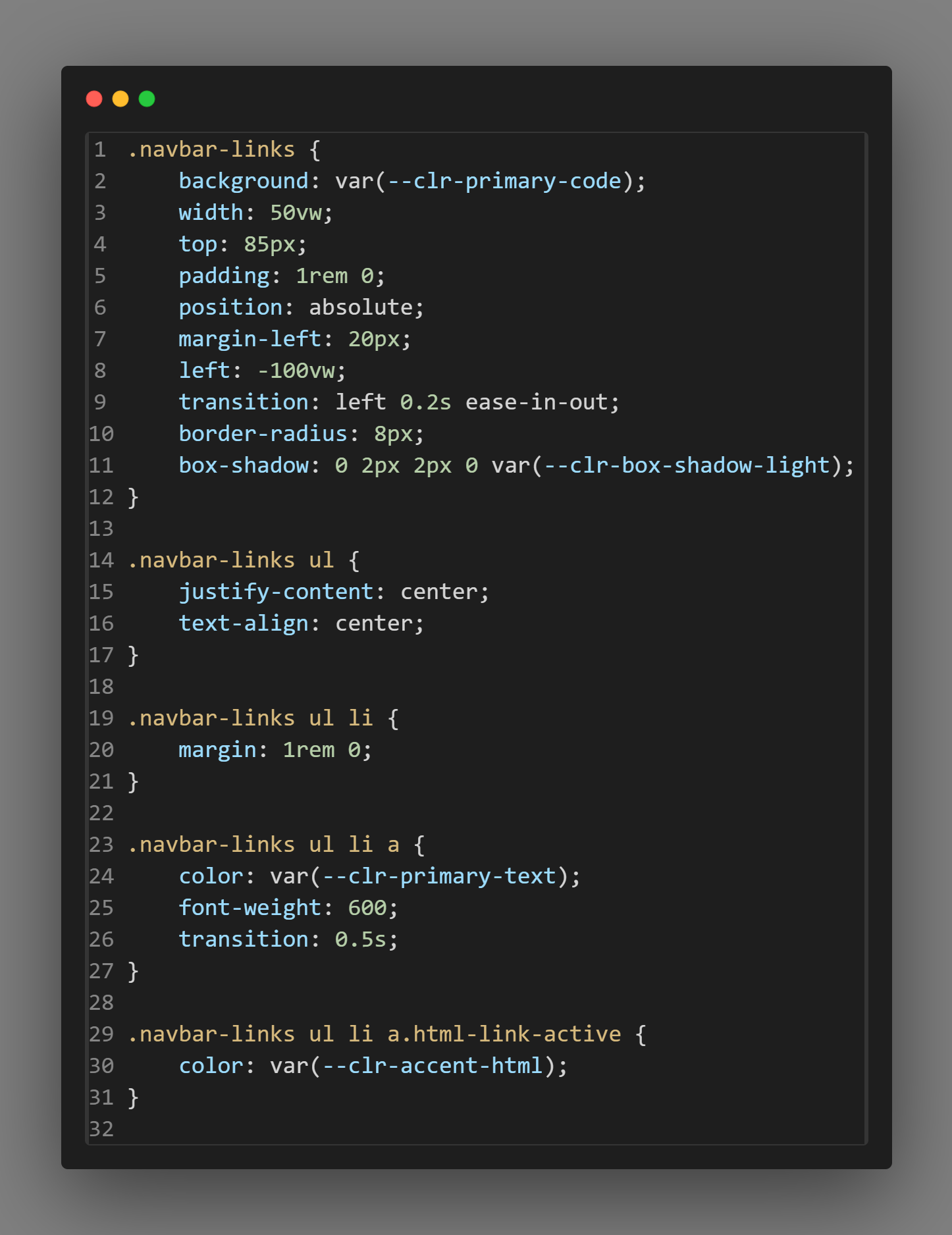
Navbar Links Styling:
The links within the navbar are styled using the ".navbar-links" class. Properties such as background-color, width, padding, position, and transition are applied to customize the appearance and behavior of the navbar links. Additionally, nested selectors target specific elements within the navbar links, such as list items and anchor tags. Hover effects are achieved using the ":hover" pseudo-class to change text color and add a bottom border when users interact with the links.
CSS Responsive Styles:
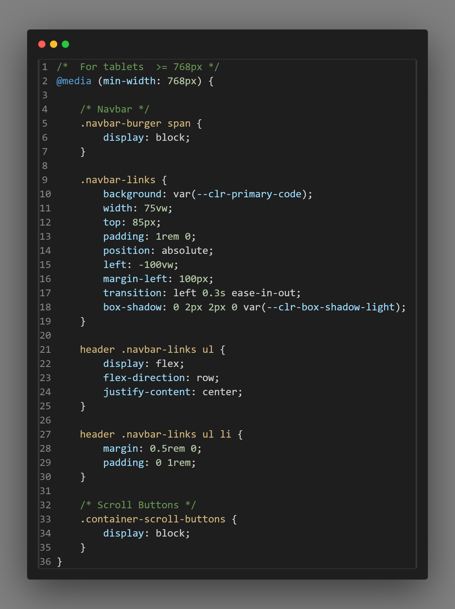
Responsive Design:
The provided CSS code snippet also demonstrates responsive design techniques. Media queries or toggling classes based on user interactions are used to adjust the layout and styling of elements for different screen sizes or device orientations. For example, the ".navbar-toggle:checked ~ nav" selector changes the left positioning of the navbar when the toggle button is checked, facilitating smooth navigation on mobile devices.
But wait, there's even more
- SCSS
- Syntactically Awesome Style Sheet SCSS (Sassy CSS) is a preprocessor scripting language that is a superset of CSS.
- Bootstrap
- Bootstrap is an open-source framework containing CSS and JavaScript-based
- Tailwind CSS
- Tailwind CSS’s official documentation describes it as a “utility-first CSS"